
24 Neutral Living Room Ideas That Feel Warm, Not Boring
Quick answer: The neutral living rooms that actually feel good to sit in are built on warm neutrals, not cool grays. Sherwin-Williams Accessible Beige SW 7036, Benjamin Moore Edgecomb Gray HC-173, and Farrow and Ball Skimming Stone No. 241 are the three most reliable wall colors. Keep the walls soft, build warmth with texture (boucle, heavy linen, oak, jute, wool), then add one dark anchor such as charcoal window frames or a walnut console so the room reads calm instead of washed out.
Neutral living rooms get a bad reputation, and honestly, some of it is earned. We have all walked into a beige room that felt like a hotel lobby with the lights off. Flat walls, matching sofa, one sad throw pillow doing all the work.
But that is a styling problem, not a color problem.
Done well, a neutral living room is the easiest room in the house to live with. It takes daylight beautifully. It does not fight your art or your rug or the dog. And it lets you swap out cushions in October and again in April without repainting anything.
Below are 24 ideas for getting there, grouped by what they actually solve. Real paint names, real color codes, and the practical stuff nobody mentions until after you have already bought five gallons.
Start With a Warm Neutral Base
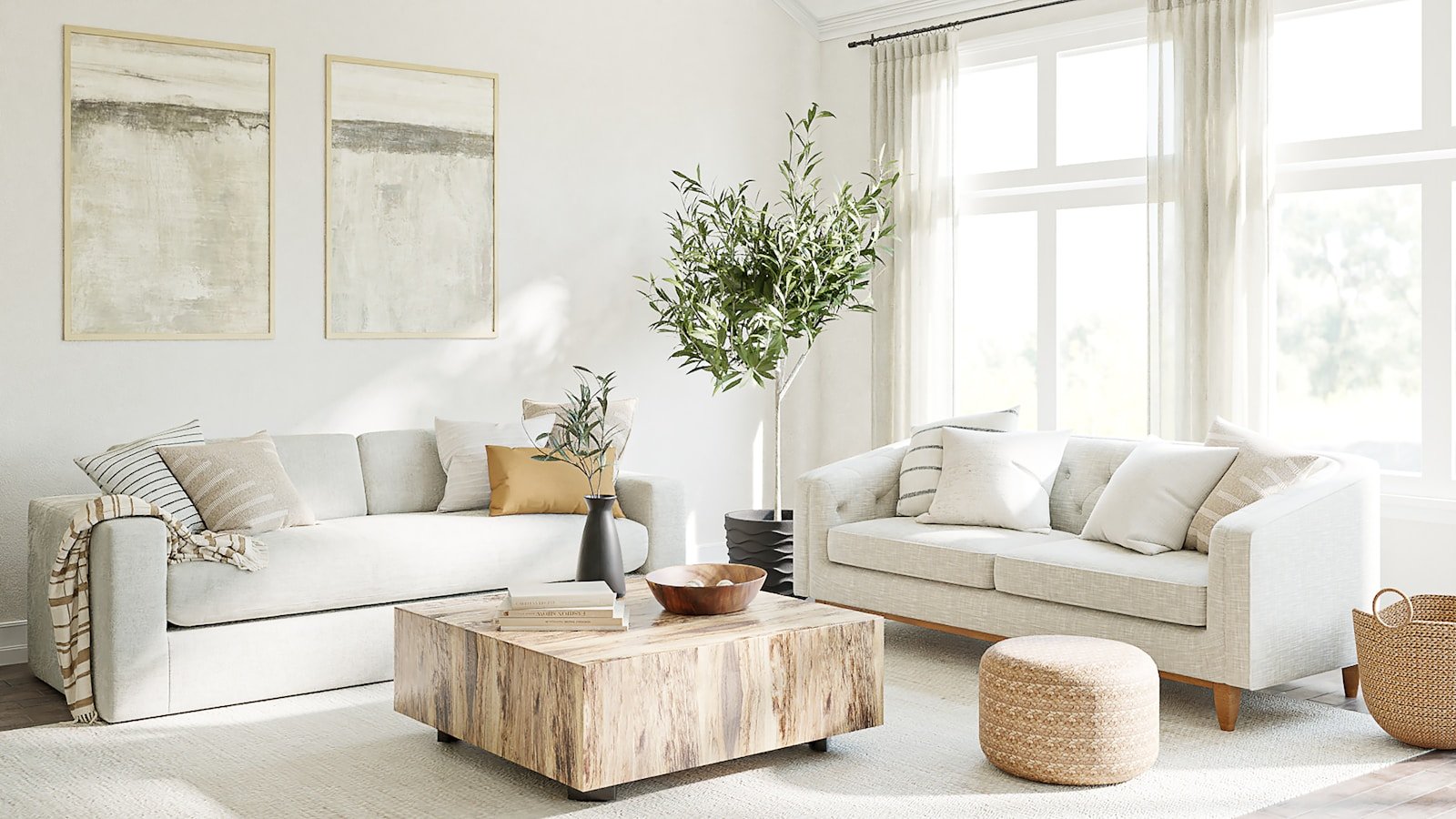
Your wall color sets the temperature of everything else. Pick a warm one and the whole room gets easier. These four are the ones designers keep reaching for, and for good reason.
1. Sherwin-Williams Accessible Beige SW 7036. If you want one safe answer, this is it. LRV 58, so it holds its color instead of bleaching out at noon. It reads soft greige in north light and gently sandy in the afternoon. Pairs with almost every wood tone you own.
2. Benjamin Moore Edgecomb Gray HC-173. A touch lighter at LRV 63 and slightly cooler than Accessible Beige, which makes it the better pick for rooms that already get a lot of warm afternoon sun. It is the classic choice for open-plan spaces because it flows into a kitchen without a hard visual break.
3. Farrow and Ball Skimming Stone No. 241. This one has a chalky, slightly pink-gray depth that photographs like nothing else. It looks expensive on a wall even in a builder-grade room. Best in spaces with decent natural light, since it can go a little heavy in a dark corner.
4. Benjamin Moore Pale Oak OC-20. The gentlest of the four. LRV around 68, warm without tipping into yellow, and it works as a whole-house neutral if you want every room to talk to each other. Great behind a lot of white trim.
Deeper Neutrals for Rooms With Plenty of Light
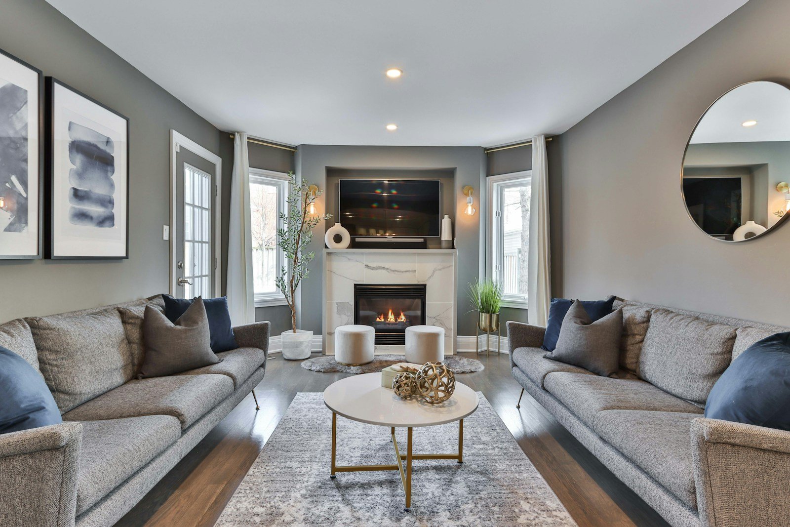
If your living room gets good sun, going one or two steps deeper is where the character lives. Pale neutrals in a bright room can wash out to nothing by 2pm. These hold on.
5. Benjamin Moore Revere Pewter HC-172. LRV 55, the original greige that launched a thousand renovations. It has a green undertone that keeps it from going purple, which is the failure mode of cheaper grays. Beautiful with cream trim and brass.
6. Farrow and Ball Elephant’s Breath No. 229. A warm gray with a magenta whisper underneath. In a sunny room it turns soft and pinkish at golden hour and settles into stone gray in the evening. It is the most alive neutral on this list.
7. Sherwin-Williams Balanced Beige SW 7037. Genuinely beige, no apology. Around LRV 46, so it gives you a proper wall color rather than a whisper. Very good in rooms with a lot of white furniture that need something to push against.
8. Benjamin Moore Manchester Tan HC-81. The warm, slightly golden option. It suits traditional rooms with wainscoting and older wood floors, and it makes an oatmeal sofa look intentional rather than beige-on-beige.
9. Farrow and Ball Drop Cloth No. 283. A muddy mid-gray with brown in it. Use this when you want a neutral room that leans moody, and pair it with off-white trim so the contrast stays soft. It is a favorite for rooms with big windows and low ceilings.
Texture Is What Keeps Neutral From Reading Flat
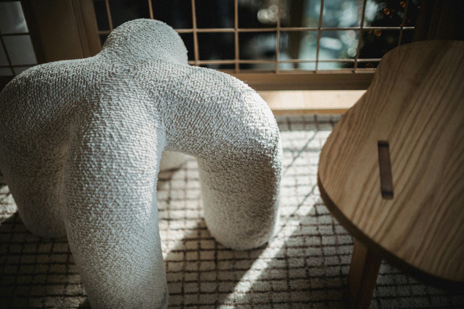
This is the part people skip. A neutral room with five smooth surfaces looks unfinished. A neutral room with five different textures looks designed. Same colors, completely different result.
10. Put boucle somewhere. One boucle chair or a boucle ottoman does more for a beige room than any amount of extra decor. The nubby weave catches light and shadow, which is what your eye reads as depth.
11. Slipcover in heavy linen, not cotton. Linen wrinkles. That is the point. The soft creases give a sofa a lived-in look that a crisp cotton cover never manages, and it reads relaxed rather than fussy.
12. Layer a wool rug over jute. Big jute rug on the bottom for scale, a smaller wool or vintage rug on top for softness underfoot. It solves the “my rug is too small” problem and adds texture at the same time.
13. Try limewash or a plaster finish on one wall. Limewash gives a wall a cloudy, uneven depth that flat paint cannot fake. Keep it to the fireplace wall or the wall behind the sofa so it stays a feature rather than a whole mood.
14. Bring in oak, cane, and rattan. Light woods keep a neutral scheme from getting heavy. A cane-front cabinet or a rattan basket adds pattern without adding another color, which is exactly what these rooms need.
Add Contrast So the Room Has a Backbone
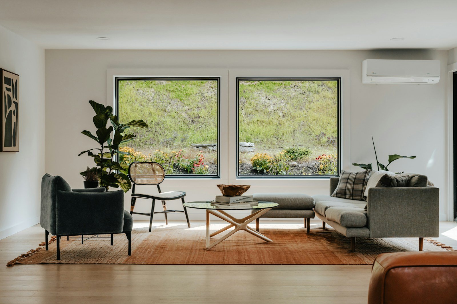
Every good neutral room has one dark thing in it. Without that anchor, your eye has nowhere to land and the whole space feels a bit soft-focus.
15. Paint the window frames or interior doors dark. Sherwin-Williams Iron Ore SW 7069 (LRV 6) is the go-to. It is a soft black with gray in it, so it never looks harsh next to warm walls. Instant architecture in a plain room.
16. Add one charcoal accent chair. Benjamin Moore Kendall Charcoal HC-166 is the equivalent in paint if you would rather do a built-in or a media cabinet. Either way, one deep piece pulls the whole scheme together.
17. Use walnut or dark-stained oak for a console. Dark wood does the contrast job while still feeling warm, which black metal does not always manage. A walnut console behind the sofa is one of the highest-impact single purchases in a neutral room.
18. Give the fireplace a stone-toned surround. Farrow and Ball London Stone No. 6 painted on a plain brick or MDF surround turns an ignorable fireplace into the focal point. It is deeper than the walls but stays in the same warm family.
19. Hang art in heavy dark frames. Even simple prints look considered in a chunky black or dark walnut frame. Group three or four at the same height rather than scattering them, and keep the mats generous.
Small Moves That Warm the Whole Room
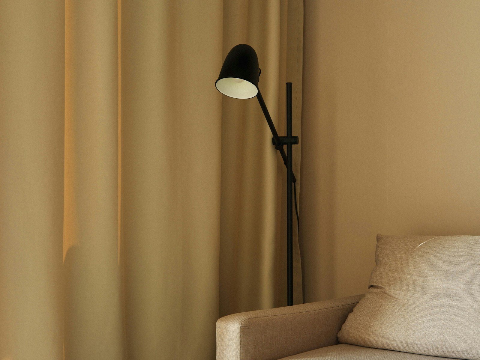
These are the finishing touches. Cheap, fast, and they are usually the difference between a neutral room that works and one that does not.
20. Switch every bulb to 2700K. Cool white bulbs will turn your beautiful warm beige into an office. Warm white at 2700K, on dimmers, across at least three light sources (overhead, table lamp, floor lamp) is the single cheapest upgrade here.
21. Hang curtains high and long. Rod close to the ceiling, panels brushing the floor, in a shade one step lighter than your walls. The room gets taller and the window stops looking like a hole in the wall.
22. Let one soft color in. A clay or blush tone keeps the scheme from going monastic. Farrow and Ball Setting Plaster No. 231 in a cushion, a throw, or the inside of a bookcase is enough. You need very little of it.
23. Add something living. An olive tree in a woven basket, a big branch in a floor vase, dried pampas if you prefer low maintenance. Green is the one color that never clashes with a neutral scheme, and the irregular shape breaks up all those straight lines.
24. Consider color drenching the ceiling. Painting the ceiling the same color as the walls, in a flat finish, makes a room feel enveloping rather than boxy. It works especially well with the deeper neutrals in section two. If that feels like a step too far, keep the trim in Benjamin Moore White Dove OC-17 and let it do the crisping.
How to Choose Your Neutral Without Regretting It
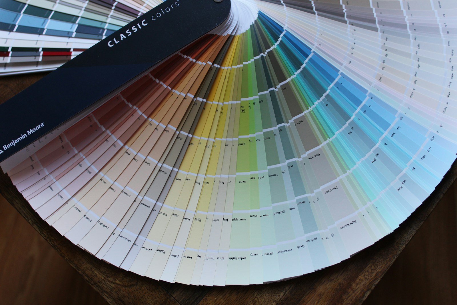
Three things decide whether a neutral works in your specific room, and none of them are visible on a paint chip.
Light direction. North-facing rooms get cool, indirect light all day, which drags gray paints toward blue and purple. Go warmer than you think you need. South-facing rooms get the opposite problem and can make a warm beige look yellow, so lean slightly cooler or deeper.
LRV. Light Reflectance Value runs from 0 (black) to 100 (pure white). Anything above 70 will look close to white on a wall. The 50 to 65 range is where most usable neutrals live. If a color looked great in a showroom and disappeared at home, LRV is usually why.
Undertone. Hold your sample against a sheet of plain printer paper. Whatever color it looks next to true white is the undertone, and that is what will show up on your walls at scale. Then tape a large sample, at least two feet square, on two different walls and look at it at 9am, 2pm, and 8pm with the lamps on. Two days of that will save you a repaint.
One more thing worth saying: your fixed elements vote too. Your floor, your stone, your sofa. If your floor has a strong orange cast, a cool greige will fight it all day. Choose the wall color last, around what you are keeping.
If you want a deeper look at warm neutrals across the whole house, our guide to warm neutral home decor ideas covers palettes room by room. If you are working with a smaller footprint, small living room color ideas gets into how these same colors behave in tight spaces. And for a softer, greener take on the same calm feeling, have a look at these sage green living rooms.
Frequently Asked Questions
What is the best neutral paint color for a living room?
Sherwin-Williams Accessible Beige SW 7036 is the safest all-round choice. At LRV 58 it stays warm without going yellow, and it works in most light conditions. Benjamin Moore Edgecomb Gray HC-173 is the better option if your room already gets strong warm sun.
Are gray living rooms out of style?
Cool, blue-leaning grays have fallen out of favor, yes. Warm grays and greiges with brown or green undertones (Revere Pewter, Drop Cloth, Skimming Stone) have not. The shift is toward warmth, not away from neutrals.
How do I stop my neutral living room from feeling boring?
Texture and contrast. Aim for at least four different materials (linen, wool, wood, ceramic, boucle, jute) and one genuinely dark element, whether that is painted trim, a charcoal chair, or a walnut piece of furniture. Color is rarely the problem.
Should the trim be white or the same color as the walls?
White trim gives you crispness and a bit of definition, which suits traditional rooms. Trim painted the same color as the walls makes a room feel larger and more modern because the eye is not stopped at every edge. Both are correct, so pick based on whether your room needs structure or space.
What color sofa works best in a neutral living room?
Oatmeal, mushroom, and soft cream all work, provided the sofa is not the exact same shade as the wall. Aim for two or three steps of difference. If you want the sofa to be the anchor instead, a deep olive or charcoal one sits comfortably in a warm neutral scheme.
Can I mix warm and cool neutrals?
You can, but keep one dominant. A room that is 80 percent warm with a few cool gray accents reads deliberate. A 50-50 split usually reads like an accident, because the eye keeps trying to decide what the room’s temperature is.
How many neutral shades should a living room have?
Three to five, spread across walls, large furniture, and textiles. Fewer than three tends to feel flat, and more than five starts to look unresolved. Repeat each shade at least twice in the room so it feels planned.
Pulling It Together
Start with the wall color, because it is the hardest thing to change later. Get the temperature right for your light. Then spend your energy on texture and on that one dark anchor, which is where nearly all the character comes from.
You do not need every idea here. Pick a base from section one, two or three texture moves, and one contrast element, and the room will already be most of the way there.
For more color-led room ideas, browse the full living room color ideas collection.