24 Autumn Color Palettes That Make Any Room Feel Warmer
Autumn color is easier to get wrong than it looks. Pile on enough orange and a room starts to feel like a seasonal aisle at the craft store. Go too safe and you end up with beige that says nothing at all.
The fix is a palette, not a color. Three or four shades that already agree with each other, so the rust reads rich instead of loud and the cream reads warm instead of dingy. Below are 24 autumn color palettes I would actually live with, built from real paint colors you can buy this week, grouped by mood and by room.
Quick answer: what makes a good autumn color palette?
Pick one warm anchor (rust, olive, gold, or deep brown), one soft neutral for the walls, and one deep shade for contrast, then repeat each one at least three times around the room. A reliable starting mix is Sherwin-Williams Cavern Clay SW 7701 with Accessible Beige SW 7036 and Iron Ore SW 7069. Keep the split roughly 60 percent neutral, 30 percent anchor, 10 percent contrast, and test every color on the actual wall before you commit.
Rust, Terracotta and Clay Palettes
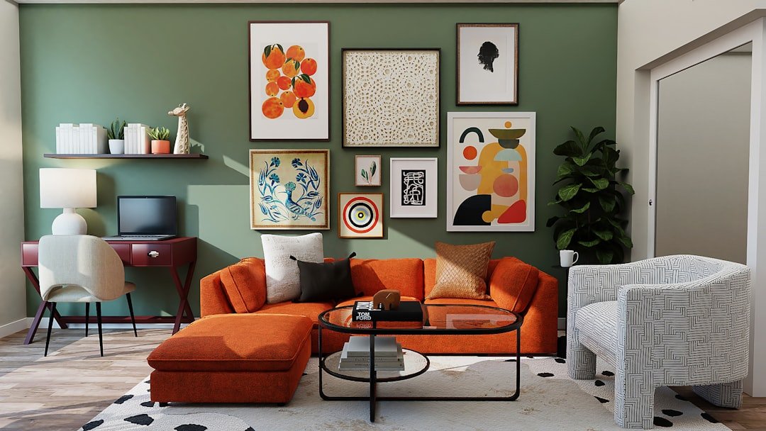
This is the family most people mean when they say autumn. The trick is pairing the clay tone with a neutral that has some warmth in it, so the two colors sit in the same room without arguing.
1. Cavern Clay, Alabaster and walnut. Sherwin-Williams Cavern Clay SW 7701 (LRV 22) is a dusty adobe with real depth. Put it on a single wall or a fireplace surround, keep everything else in Alabaster SW 7008 (LRV 82), and let walnut furniture carry the middle. Warm and grounded, never costume-y.
2. Red Earth, Oxford Stone and brass. Farrow and Ball Red Earth No. 64 is a softer, chalkier clay than it looks on a chip. Wrap it around a small room, run Oxford Stone No. 264 on the trim, and add unlacquered brass hardware. Good in a powder room or a dining room you only use at night.
3. Audubon Russet, Manchester Tan and charcoal. Benjamin Moore Audubon Russet HC-51 gives you the brick end of autumn. Balance it with Manchester Tan HC-81 (LRV 64) on the surrounding walls and Kendall Charcoal HC-166 (LRV 32) on a console or built-in. The charcoal keeps the whole thing from going country.
4. Rookwood Terra Cotta, Accessible Beige and Iron Ore. Rookwood Terra Cotta SW 2803 comes out of the historic collection, so it has that slightly muddy, aged quality. Use it in small doses: a bookcase back, a bench, a stair riser. Accessible Beige SW 7036 (LRV 58) on walls, Iron Ore SW 7069 (LRV 6) on window frames.
Deep and Moody Autumn Palettes
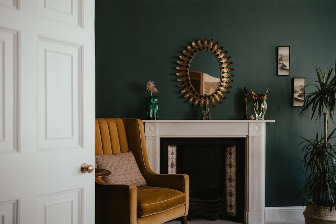
Short days are the reason these work. When the light drops at four in the afternoon, a dark room stops fighting the season and starts using it.
5. Hague Blue, Setting Plaster and brass. Farrow and Ball Hague Blue No. 30 is nearly black in low light and clearly blue by a window. Pair it with Setting Plaster No. 231, a pink-toned plaster shade, for a combination that feels vintage without feeling fussy. Brass lamps do the rest.
6. Studio Green, Oxford Stone and oak. Studio Green No. 93 reads black until it catches sun. Use it on joinery or a whole small study, keep the ceiling in Oxford Stone No. 264 so it does not close in, and bring in warm oak shelving. Very quiet, very expensive looking.
7. Soot, Bleeker Beige and cognac leather. Benjamin Moore Soot 2129-20 is a blue-black that behaves better than true black in rooms with cool north light. Warm it up with Bleeker Beige HC-80 walls and a cognac leather chair. The leather is doing the autumn work here.
8. Brinjal, Skimming Stone and aged brass. Brinjal No. 222 is an aubergine that most people write off and then fall for. It is gorgeous on a dining room wall against Skimming Stone No. 241 trim, especially by candlelight. Keep the metals warm and slightly tarnished.
Soft Neutral Autumn Palettes
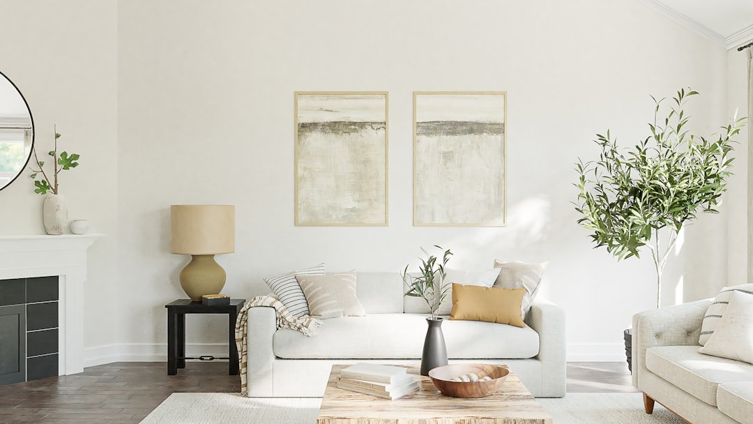
If you rent, or you just do not want to repaint in January, this is your group. These palettes hold their warmth all year and let you swap the season in through textiles.
9. Accessible Beige, White Dove and camel. Accessible Beige SW 7036 on the walls, Benjamin Moore White Dove OC-17 (LRV 85) on trim and ceiling, then camel and caramel in the throws and cushions. The greige base means a rust pillow in October and a pale linen one in June both look intentional.
10. Edgecomb Gray, Swiss Coffee and a rust accent. Edgecomb Gray HC-173 (LRV 63) is the safest warm greige in the business. Swiss Coffee OC-45 (LRV 83) on trim keeps it soft rather than stark. Then one rust element, a leather pouf or a clay lamp, to anchor the season.
11. Elephant’s Breath, School House White and walnut. Farrow and Ball Elephant’s Breath No. 229 shifts between warm gray and mauve as the light changes, which is exactly why it suits autumn. School House White No. 291 on woodwork, walnut or smoked oak underfoot.
12. Kilim Beige, Shoji White and olive. Kilim Beige SW 6106 (LRV 57) leans properly warm, almost tan. Shoji White SW 7042 (LRV 74) softens the trim, and an olive velvet chair pulls the whole palette into fall. Works beautifully in a south-facing room that already gets golden afternoon light. For more in this direction, see our modern beige interior ideas.
Green and Olive Autumn Palettes
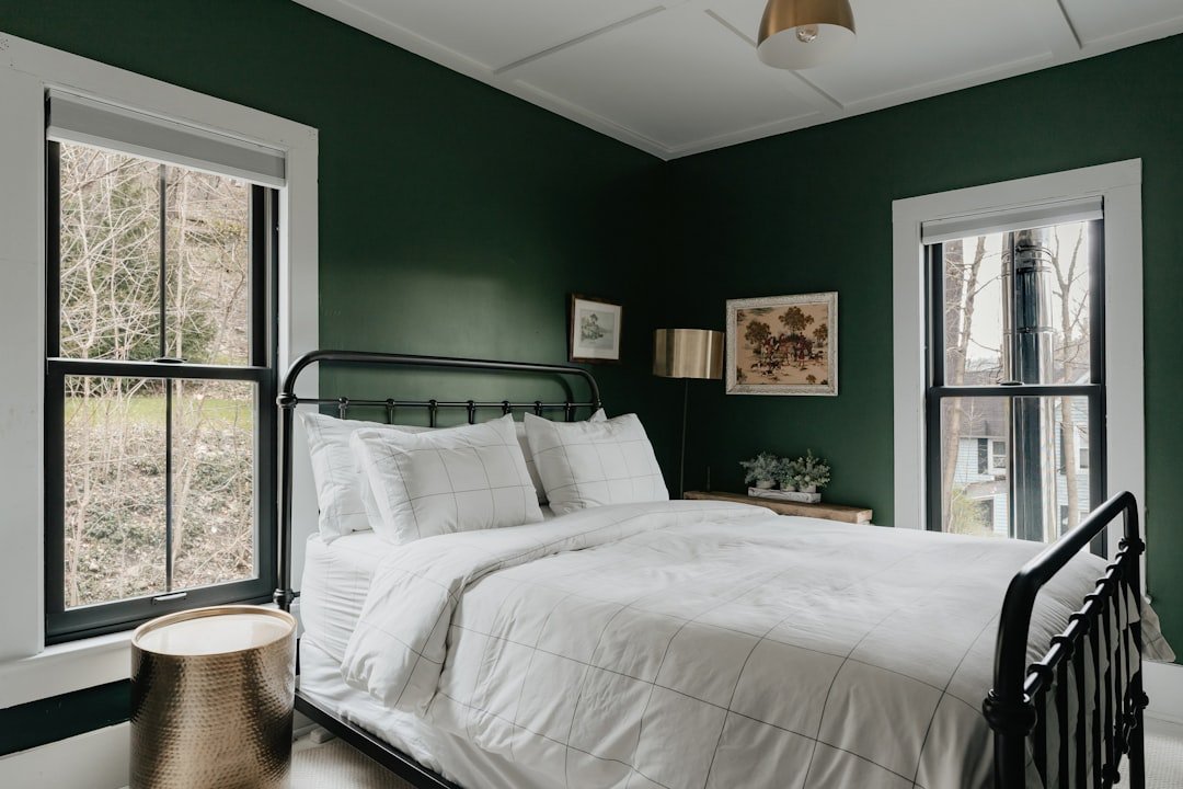
Green is the autumn color people forget. Look at a hedgerow in October and there is more olive and moss in it than orange.
13. October Mist, White Dove and terracotta. Benjamin Moore October Mist 1495 was their color of the year in 2022 and it has aged well. It is a sage with a gray backbone, so it stays calm. White Dove trim, terracotta pots and a jute rug finish it.
14. Pewter Green, Alabaster and brass. Pewter Green SW 6208 (LRV 12) is dark enough for a whole feature wall, kitchen island, or built-in bookcase. Alabaster keeps the rest of the room bright. Unlacquered brass pulls warm it up on contact.
15. Bancha, Joa’s White and rust. Farrow and Ball Bancha No. 298 is a deep olive with a hint of brown, so it sits naturally beside rust and tan. Joa’s White No. 226 on the walls, a rust wool throw over the arm of the sofa. Excellent in a snug or a home office.
16. Ripe Olive, Natural Linen and black. Ripe Olive SW 6209 is nearly a neutral in a dim room. Pair it with Natural Linen SW 9109 for the walls and use matte black on lighting and hardware. If you like the olive route, our olive green decor ideas go deeper on accessories and textiles.
Gold, Mustard and Amber Palettes
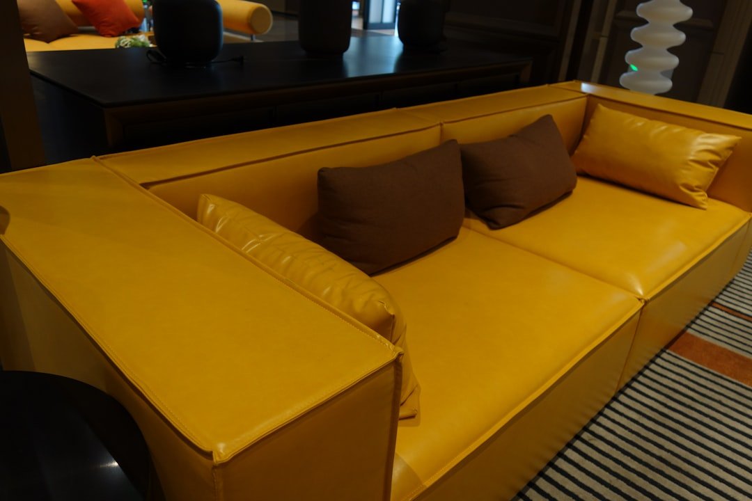
Yellow gets a bad reputation because most people reach for the wrong one. Autumn yellows are dirty, ochre-based, closer to turmeric than to lemon.
17. India Yellow, Shaded White and walnut. Farrow and Ball India Yellow No. 66 is a proper ochre with brown in it. It glows in hallways and stairwells that get almost no natural light. Shaded White No. 201 on the woodwork stops it from tipping into gold-leaf territory.
18. Dorset Gold, White Dove and navy. Benjamin Moore Dorset Gold HC-8 is soft enough for a whole room. Add Hale Navy HC-154 (LRV 8) as the contrast on a door or a piece of furniture, keep the trim White Dove. Classic New England, works everywhere.
19. Restrained Gold, Accessible Beige and Iron Ore. Restrained Gold SW 6129 is more of a khaki-gold, which makes it easy to live with. Use it in a dining room, hold Accessible Beige in the connecting spaces, and put Iron Ore on the interior doors for weight.
20. Sudbury Yellow, Oxford Stone and Green Smoke. Sudbury Yellow No. 51 is warm and a little historic. Green Smoke No. 47 as the accent, on a bookcase or the back of a cabinet, gives you that faded English country feel without the chintz.
Kitchen and Dining Autumn Palettes
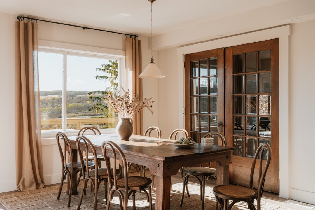
Kitchens hold their color longer than any other room, so these lean toward shades you will still like in three years. All four assume warm wood or warm stone somewhere in the mix.
21. Card Room Green cabinets, School House White walls. Farrow and Ball Card Room Green No. 79 is a gray-green that photographs beautifully on shaker doors. White walls above, brass or aged bronze pulls, and a butcher block or oiled oak counter to warm the base.
22. Urbane Bronze island, Alabaster perimeter. Urbane Bronze SW 7048 (LRV 8) is a warm charcoal that behaves like a neutral. Put it on the island only, keep the perimeter cabinets Alabaster, and add white oak open shelving. Autumn without a single orange thing in sight.
23. Tate Olive cabinets, Swiss Coffee walls, soapstone. Benjamin Moore Tate Olive HC-112 is a muted, slightly gray olive that suits older houses. Swiss Coffee OC-45 above, honed soapstone or a dark quartz counter, and simple brass bin pulls. Pairs well with our warm white kitchen ideas if you want to mix the two.
24. Dried Thyme, Shoji White and terracotta tile. Dried Thyme SW 6186 on a pantry door or lower cabinets, Shoji White SW 7042 on the walls, and a terracotta or zellige backsplash to carry the clay tone. This one gets better as the tile ages.
How to Build Your Own Autumn Palette
Start with the thing you cannot change. Your floor, your countertop, your sofa. Whatever undertone that has, warm or cool, your paint has to agree with it or the room will feel slightly off and you will never work out why.
Then use the 60-30-10 split. Sixty percent is the neutral doing most of the wall and ceiling work. Thirty percent is your autumn anchor, on furniture, an accent wall, or cabinetry. Ten percent is the deep contrast that keeps the room from going soft: black hardware, a charcoal frame, a navy door.
Pay attention to LRV, the light reflectance value printed on most paint chips. Anything under about 25 will visibly darken a room, which is the point in a snug and a problem in a small north-facing bedroom. Anything over 70 will bounce light around and can wash out in strong sun.
Light direction matters more than the season. North-facing rooms get cool, flat light all day, so warm ochres and clay tones sit well there and cool grays go gloomy. South-facing rooms get golden light that pushes yellows further yellow, so a muted olive or a greige holds up better.
Finally, test properly. Paint two coats on a large piece of poster board, move it around the room, and look at it in the morning, at four in the afternoon, and under your lamps at night. Autumn palettes live mostly in evening light, so that last check is the one that counts.
Frequently Asked Questions
What are the classic autumn colors for a home?
Rust and terracotta, ochre and mustard, olive and moss green, warm browns, and cream or tan as the neutral. Deep aubergine and navy work as contrast shades. The common thread is that all of them are muted rather than bright.
How many colors should an autumn palette have?
Three or four. One neutral for most of the surfaces, one warm anchor, one deep contrast, and optionally a metal or wood tone. Beyond four the room starts to look busy instead of layered.
Can I use autumn colors in a small room?
Yes, and dark ones often work better there than pale ones. A small room painted entirely in a deep olive or navy reads as intentional and cozy, while the same room in pale beige just reads as small. Keep the trim the same color as the walls so the corners disappear.
What white goes with autumn colors?
A warm white with a touch of yellow or gray in it. Benjamin Moore White Dove OC-17 and Swiss Coffee OC-45, or Sherwin-Williams Alabaster SW 7008 and Shoji White SW 7042, all sit comfortably next to rust and olive. A crisp blue-white will make warm colors look dirty.
Do autumn colors work all year?
The muted ones do. Olive, greige, ochre and warm brown read as seasonal in October and as simply warm in May. If you want a palette that flips with the calendar, keep the walls neutral and change the textiles instead, which is the approach behind our fall bedroom decor ideas.
What is the easiest autumn palette for a beginner?
Warm greige walls, cream trim, and rust or camel textiles. Accessible Beige SW 7036 with White Dove OC-17 is close to foolproof, and it lets you experiment with accent colors without repainting.
Should the ceiling be white in a dark autumn room?
Not always. In a room painted a deep shade, taking that same color onto the ceiling at a lighter mix, or using a soft off-white like Oxford Stone rather than a bright white, keeps the space feeling wrapped rather than capped.
Where to Start This Week
Pick one palette from the list, buy sample pots of all three colors, and paint them on board tonight. You will know within a day whether the combination suits your light, and that costs less than a takeaway. If you want a room-specific place to begin, our cozy fall living room color ideas take several of these palettes and show them in context.