
24 Navy Living Room Ideas That Feel Rich, Not Dark
Quick answer: The navy living rooms that actually work pair a deep, slightly grayed blue with warm neutrals and real texture. Start with a proven paint like Benjamin Moore Hale Navy HC-154, Sherwin-Williams Naval SW 6244, or Farrow and Ball Hague Blue No. 30. Keep the trim soft white rather than stark white, add wood and brass to warm the blue up, and give the room at least one cream or oatmeal anchor so the navy reads rich instead of heavy.
Navy is the one dark color people are willing to try. It has that thing where it feels bold and safe at the same time, probably because we have all worn it since we were kids and nobody ever regretted a navy coat.
But navy living rooms go wrong in a very specific way. The blue turns flat and a little bit cold, the room ends up feeling like a hotel conference suite, and everyone quietly wishes they had gone greige.
That is almost always a pairing problem, not a paint problem. Navy needs warmth next to it. Wood, brass, cream, leather, linen, a lamp with an actual bulb glow. Get that part right and a navy room is one of the most flattering things you can do to a living space.
Here are 24 ways to use it, from full walls down to a single cushion, with real paint names so you are not guessing at a swatch wall.
Deep Navy Walls That Feel Cozy, Not Closed In
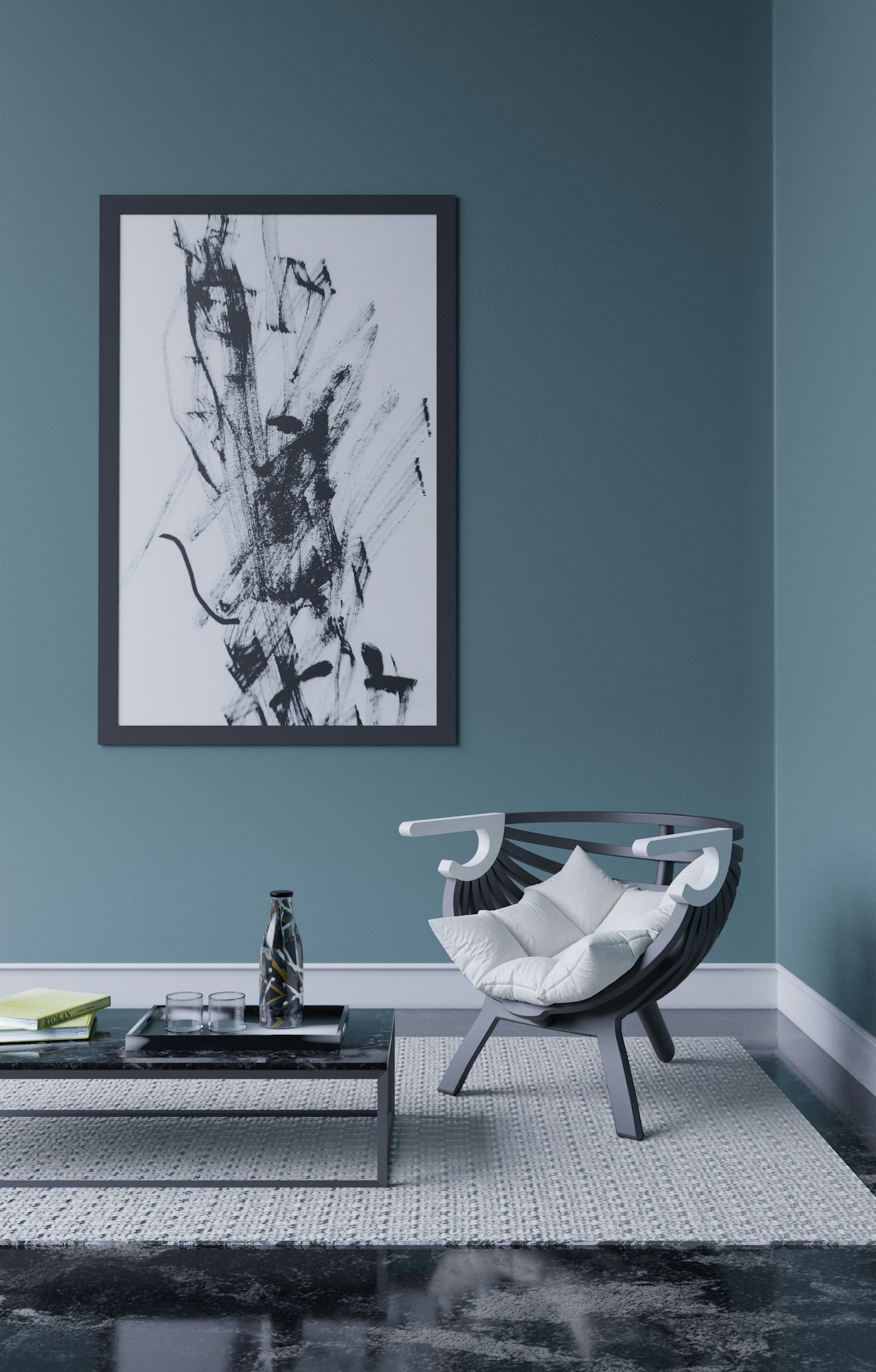
1. Hale Navy on all four walls. Benjamin Moore Hale Navy HC-154 is the default for a reason. It has enough gray in it that it never goes electric, and it shifts beautifully between daylight and lamplight. In a north-facing room it settles into a soft slate. In an evening room with warm bulbs it goes properly velvety.
2. Naval with soft white trim. Sherwin-Williams Naval SW 6244 is a touch cleaner and more classic than Hale Navy. Pair it with SW Alabaster SW 7008 on the trim instead of a bright white. The half-step of warmth in Alabaster stops the contrast from looking like a striped rugby shirt.
3. Hague Blue for a room with real light. Farrow and Ball Hague Blue No. 30 leans slightly green, which is exactly why it looks so good in period rooms with tall windows. It is a very low light-reflectance color, so it wants either good natural light or a genuinely good lighting plan. Estate Emulsion gives it that chalky depth. Modern Emulsion is the sensible choice if you have a dog.
4. Navy on the walls, ceiling left alone. If you are nervous, this is the version to do. Dark walls with a soft white or very pale ceiling keeps the room feeling tall. Save the color-drenched ceiling for a snug or a room you actively want to feel smaller and warmer.
Navy Sofas and Statement Seating
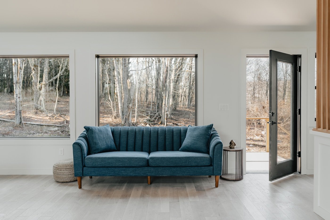
5. A navy velvet sofa against pale walls. The reverse arrangement. Walls in something like Benjamin Moore White Dove OC-17 or Sherwin-Williams Shoji White SW 7042, then a deep navy velvet sofa doing all the heavy lifting. This is the renter-friendly navy living room, and it photographs ridiculously well.
6. Navy linen for something quieter. Velvet reads formal. A slubby navy linen or a heavy cotton reads like a house people actually live in. It also hides dog hair a lot better than you would expect, though it does show sun fade on the side nearest the window.
7. Two navy armchairs instead of one navy sofa. If your sofa is already neutral and you like it, add the color in a pair of chairs. Two matching navy chairs facing the sofa gives you a proper conversation layout and a much smaller commitment.
8. A navy chesterfield with brass casters. Deep buttoning plus warm metal is basically the cheat code for making navy feel expensive. It works in a traditional room and in a stripped-back modern one, which is rare.
Renter-Friendly Navy Accents
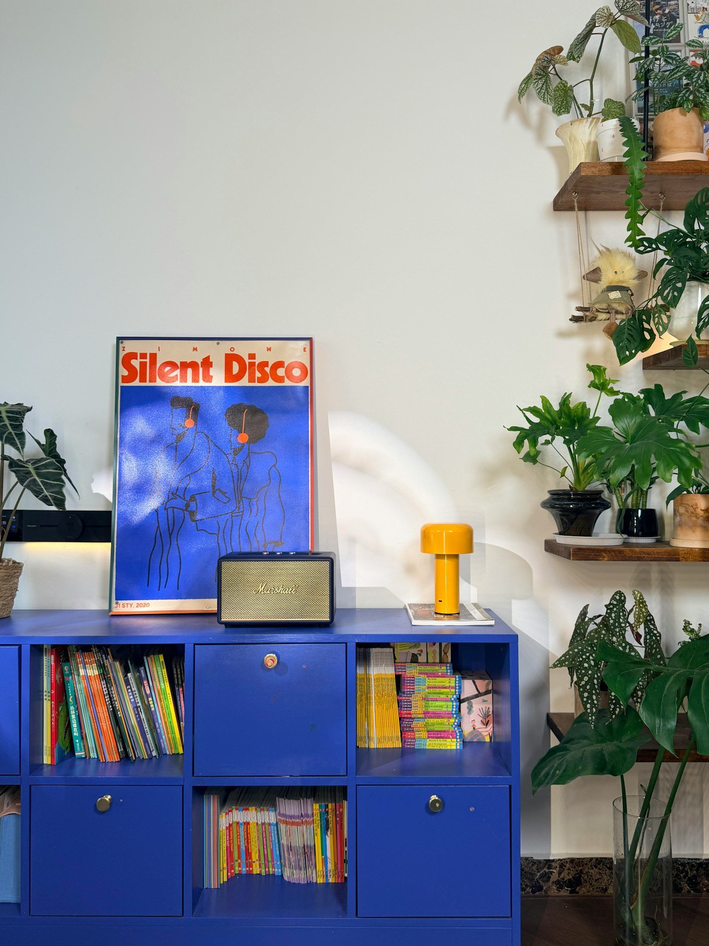
9. One navy wall behind the sofa. Accent walls got a bad reputation, mostly because people put them on the wrong wall. Behind the sofa works. The wall with the window usually does not. If you rent, one wall is also the cheapest thing to paint back.
10. Navy inside the bookshelves. Paint just the back panels of an alcove or a bookcase. Your books and objects suddenly look curated instead of stacked, and you have used maybe a quart of paint. Try Benjamin Moore Van Deusen Blue HC-156 here for something slightly softer than a true navy.
11. Navy curtains, floor to ceiling. Full-length navy curtains hung high and wide add depth without touching a single wall. Line them properly. Unlined dark curtains fade fast and they never hang quite right.
12. Navy in the rug only. A vintage-style rug with navy in the pattern, on top of pale floors, gives you the color grounded at floor level where it makes a room feel anchored rather than closed in. This is a good move in a small space, and it pairs neatly with the tricks in our guide to small living room color ideas.
Navy With Warm Neutrals
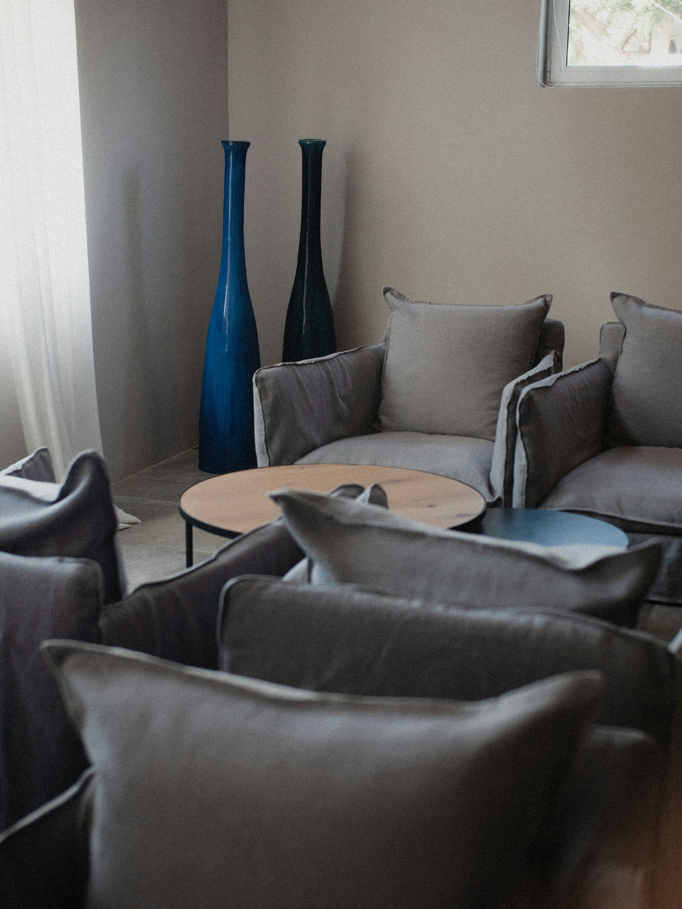
13. Navy and oatmeal. The most reliable pairing in the whole list. Navy walls, oatmeal upholstery, a jute or wool rug. Nothing about it is clever, and it works every single time.
14. Navy and Accessible Beige. Sherwin-Williams Accessible Beige SW 7036 next to a deep navy is a really nice open-plan solution. Navy in the living zone, Accessible Beige carrying through the hallway, no jarring line where they meet. There is more on building a warm neutral base in our neutral living room ideas.
15. Navy and camel leather. A tan or camel leather chair against navy is one of those combinations that gets better as the leather ages. Buy the good one if you can. It is the piece you will still have in fifteen years.
16. Navy with cream boucle. Cream and navy is very high contrast, so the texture is what saves it from looking graphic. Boucle, sheepskin, a chunky knit throw. Something with a bit of fuzz on it to soften the line between the two.
Coastal and Lighter Navy Rooms
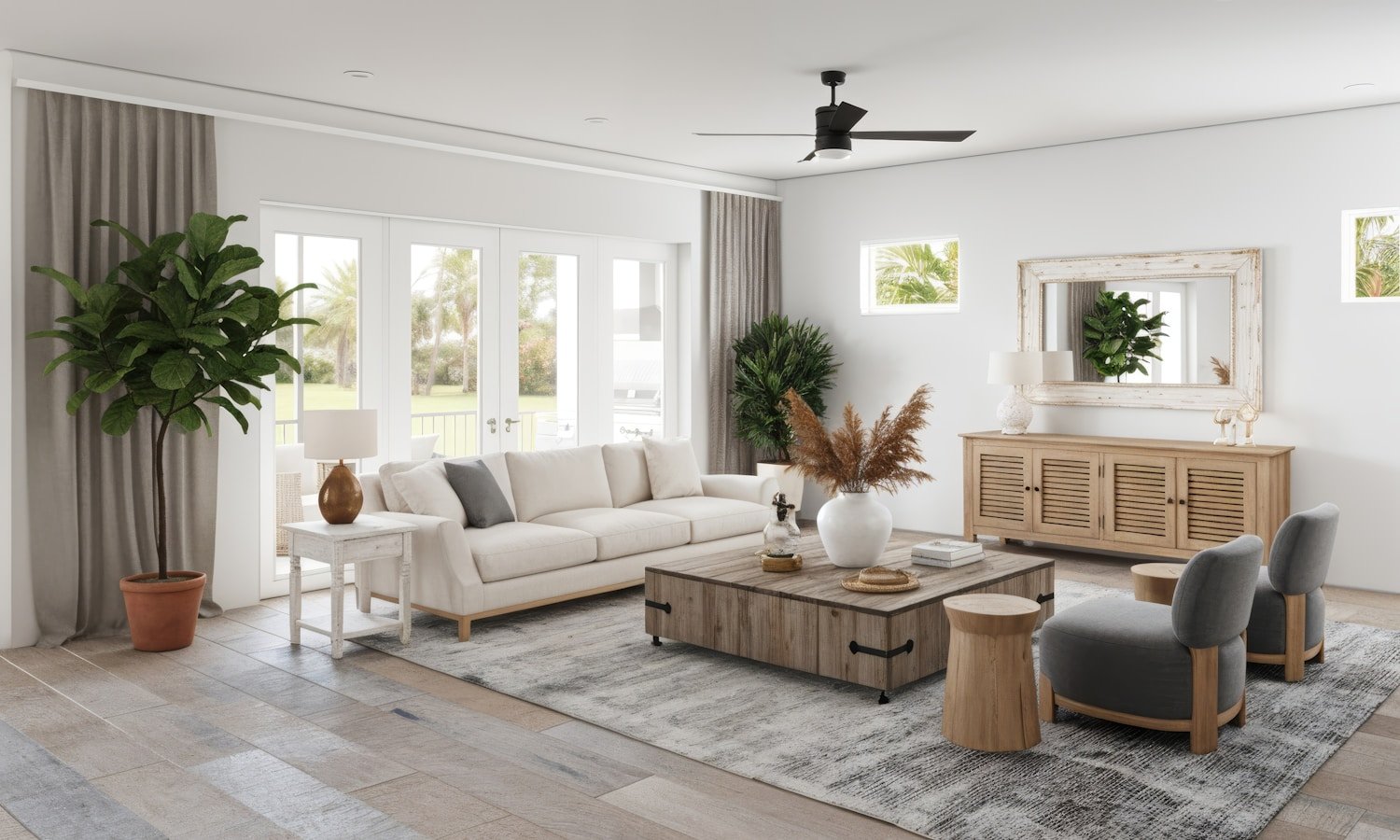
17. Navy plus white plus natural fiber. The classic coastal formula. Keep the walls white, use navy in the seating and cushions, then bring in rattan, seagrass and rope. It only tips into theme-park nautical if you add anchors, so do not add anchors.
18. A softer navy like Newburyport Blue. Benjamin Moore Newburyport Blue HC-155 is a hair brighter and more purple-leaning than Hale Navy. In a bright coastal room it stays lively instead of going murky.
19. Navy stripes. A wide navy and white stripe on a cushion, an ottoman or a roman blind is a lot friendlier than it sounds. Wide stripes read as pattern. Narrow ones read as a shirt.
20. Navy on the exterior of a built-in, white inside. Blue outer frame, white interior shelving. You get the color from across the room, and the shelves stay bright enough to actually see what is on them. Our wider blue room ideas guide covers how this plays out in other rooms too.
Moody Navy With Wood, Brass and Texture
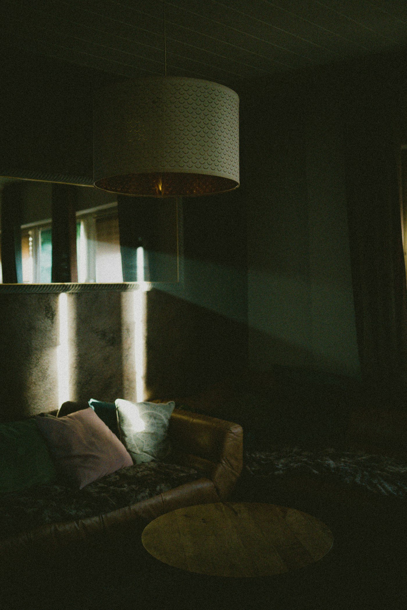
21. Navy with unlacquered brass. Lacquered brass stays shiny and eventually looks a bit flat. Unlacquered brass patinas and goes soft and golden, which is a much better foil for a cool blue. Picture lights above artwork on a navy wall are worth the wiring.
22. Navy and walnut. Mid-tone walnut has enough red in it to counter the blue directly. A walnut coffee table or console against Hague Blue does more for the room than any amount of accessorizing.
23. Navy with a black accent, not black everything. Navy and black together can look muddy if you go halves. One black element, an iron floor lamp, a black fireplace surround, is enough to sharpen everything else. Sherwin-Williams Iron Ore SW 7069 is a good near-black for this if you want a hint of softness.
24. Stiffkey Blue with layered lighting. Farrow and Ball Stiffkey Blue No. 281 is deeper and inkier than Hague Blue, and it needs at least three light sources to come alive. A floor lamp, a table lamp, and something on a dimmer overhead. Do that and it turns into the coziest room in the house after dark.
How to Choose the Right Navy for Your Room
Three things matter more than the specific paint name.
Which way your windows face. North-facing rooms get cool, blue-tinted light all day. That light pushes a navy further toward gray and can make it feel chilly, so lean toward a navy with a warm or slightly green undertone like Hague Blue. South-facing rooms get warm light and can carry a cleaner navy like Naval without any trouble.
How much light-reflectance you can afford to lose. Most true navies sit somewhere around an LRV of 4 to 10, which is very dark. That is fine in a room with a big window and good lamps. In a small dim room, consider putting the navy on joinery, a bookcase back, or the lower half of the wall instead of the whole thing.
What is already in the room. Look at your floor first. Orange-toned oak, gray-washed engineered boards and dark walnut all react to navy differently. Test with a large sample, at least two feet square, and move it around the room across a full day before you commit. Peel and stick sample squares are worth the ten dollars.
One last practical note: buy a matte or eggshell finish for navy walls. Dark colors show every roller mark and surface flaw in a satin or semi-gloss, and the flatter finish is what gives navy that soft, expensive-looking depth.
Frequently Asked Questions
Does navy make a living room look smaller?
Not really. Dark walls blur the corners of a room, which makes the edges harder to read and the space feel more enveloping rather than obviously smaller. What actually shrinks a room is patchy lighting. Add lamps at different heights and navy walls will feel cozy rather than cramped.
What is the best navy paint color for a living room?
Benjamin Moore Hale Navy HC-154 is the safest all-rounder because its gray undertone keeps it from going electric in any light. Sherwin-Williams Naval SW 6244 is the cleaner, more classic option, and Farrow and Ball Hague Blue No. 30 is the richest of the three in a room with good natural light.
What colors go with navy in a living room?
Warm neutrals first: cream, oatmeal, camel, sand. Then a natural material for texture, like jute, oak or rattan. Then one metal, ideally brass or antique gold. Blush pink, mustard and rust all work as a small accent if you want more color.
Should trim be white or navy?
White trim gives you a crisp, traditional look. Painting the trim the same navy as the walls, sometimes called color drenching, makes the room feel larger and more modern because there is no line breaking up the wall. Both are correct. If you have beautiful original moldings, white shows them off better.
Is navy still in style?
Navy has been in continuous use in interiors for well over a century, which is a good sign that it is not a trend in the risky sense. What changes is the styling around it. Right now navy is being paired with warmer neutrals and natural wood rather than the cool grays that were popular a decade ago.
Can I use navy in a small living room?
Yes, and it often looks better in a small room than a pale color does, because a small dark room feels intentional while a small pale room can just feel underfurnished. Keep the ceiling light, use full-length curtains, and put a large mirror opposite the window.
What goes wrong most often with navy living rooms?
Too much cool color and no warmth to balance it. Navy walls, gray sofa, chrome lamp and a cool white ceiling will always feel cold. Swap one of those for something warm, wood, brass, cream or leather, and the whole room resolves.
Bringing It Together
If you only take one thing from this list, make it the pairing rule. Navy is not a difficult color. It just refuses to carry a room on its own, and it will look flat until you put something warm beside it.
Start small if you need to. Paint the back of a bookcase, or bring home a navy chair and live with it for a month. You will know pretty quickly whether you want the whole wall.
For more color starting points, browse our living room color ideas or see how the same palette behaves in a sage green living room if you want something softer.