16 Wainscoting Ideas That Add Character Without Feeling Fussy
Quick answer: The easiest way to make wainscoting feel current is to keep the profile simple, choose a height that suits the room, and treat paint color as part of the architecture. Classic 36- to 42-inch wainscoting still works beautifully, but taller paneling, tonal paint and full-wall applications can feel fresher in newer homes.
Wainscoting is having another strong moment because it solves two problems at once: it protects busy walls and gives flat rooms more depth. That combination fits the broader shift toward tactile, character-rich interiors. Houzz reported U.S. searches for wainscoting up 32% in its 2026 emerging trends data, alongside growing interest in limewash, Venetian plaster and warmer, more layered finishes.
The key is proportion. A beautiful panel profile can still look wrong if the rail cuts through a window awkwardly or the height fights with nearby furniture. These ideas focus on where wainscoting works best, how high to take it, what to paint it, and which versions suit traditional, modern and small spaces.
1. Start With Classic One-Third-Height Wainscoting
For a traditional look, start around one-third of the wall height. In many rooms that lands near 36 to 42 inches. This Old House also uses that range as a classic reference point, especially in older homes.
That lower proportion works well in dining rooms, hallways, entryways and bedrooms because it adds structure without making the walls feel chopped in half.
2. Paint the Wainscoting the Same Color as the Wall
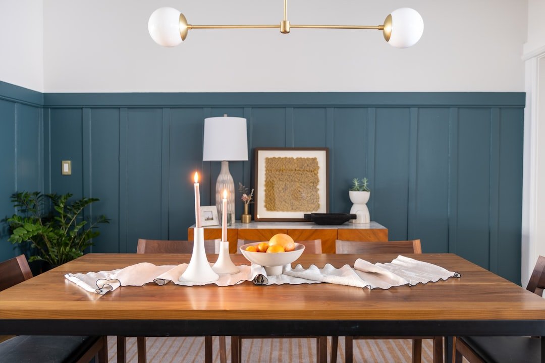
Tonal wainscoting is one of the safest ways to make traditional millwork feel modern. Paint the panels, rails and upper wall the same color, then let shadows do the work.
This works especially well with taupe, mushroom, sage, dusty blue and warm beige. It creates texture without adding a second color break, which is useful in smaller rooms.
If you like this effect, our color drenching ideas use the same continuity principle across entire rooms.
3. Use a Darker Color Below the Chair Rail
A deeper lower section is practical in busy spaces because scuffs are less obvious and the darker color gives the room visual weight. Think olive, chocolate brown, muted navy, charcoal or clay.
Keep the upper wall lighter if you want a more traditional split. For a stronger look, carry the darker color onto trim and doors too.
4. Pair Wainscoting With Wallpaper
Wainscoting and wallpaper are natural partners because the paneling gives pattern a stopping point. Use a small-scale print above classic panels, or a larger botanical or stripe above simpler board-and-batten-style molding.
In powder rooms and dining rooms, this combination can feel richer than wallpaper alone because the lower wall adds depth and durability.
For bolder combinations, see our pattern drenching ideas.
5. Take Wainscoting Higher in a Dining Room
Taller wainscoting works beautifully in dining rooms because the wall treatment can visually connect sideboards, artwork and plate rails. Instead of stopping at standard chair-rail height, take it closer to two-thirds of the wall for a more architectural effect.
This Old House notes that taller applications can work especially well when they are capped with a rail that has a clear purpose, such as displaying plates or framed pieces.
For more room-planning ideas, our dining room ideas cover lighting, rugs, furniture and color.
6. Use Simple Picture-Frame Molding for a Cleaner Look
If raised panels feel too formal, create rectangular frames with applied molding. Keep the profile slim and the spacing generous. The effect is architectural but lighter than traditional carved paneling.
This is especially useful in newer homes that need more character but not a full historical treatment.
7. Try Beadboard in Smaller or More Casual Spaces
Beadboard has a softer, more casual feel than raised paneling. It suits mudrooms, breakfast nooks, cottage kitchens, laundry rooms and narrow hallways.
Because the vertical grooves add rhythm, beadboard can also make a low wall feel slightly taller. Paint it a durable satin or semi-gloss finish where it will be touched often.
8. Use Moisture-Appropriate Materials in Bathrooms
Bathrooms need more than a pretty profile. Material choice matters. This Old House recommends moisture-conscious options such as properly sealed wood, treated MDF, PVC or tile depending on the location and exposure.
In a powder room, painted MDF can be practical. In a splash-prone bath, PVC or tile can be the safer choice.
9. Wrap Wainscoting Through an Entryway
Entryways benefit from wall protection because bags, shoes, coats and furniture all make contact with the lower wall. Wainscoting gives the area a more finished look while making scuffs easier to repaint.
Continue the same rail around corners and through short connecting halls so the architecture reads as one system rather than a feature wall.
You can pair it with the practical storage ideas in our entryway storage guide.
10. Use Wainscoting to Ground a Bedroom
Behind a bed, low wainscoting can act like a visual headboard across the entire wall. Paint it in a soft neutral or muted green, then keep the upper wall lighter.
For a more immersive look, use taller picture-frame molding in the same color as the wall. This adds depth without relying on extra artwork.
11. Match the Paneling to Warm Neutrals
Warm whites, greige, mushroom and beige are especially effective on wainscoting because the shadow lines keep them from feeling flat. The result is quiet but still architectural.
Our warm neutral home decor ideas show how texture can keep soft palettes interesting.
12. Use Rich Brown or Olive for a More Collected Feel
Warm, earthy colors are especially current in 2026. Houzz also reported strong search growth for chocolate brown, sage, taupe and cream. Wainscoting gives those colors more depth because the moldings create natural highlights and shadows.
A deep olive lower wall with cream above feels classic. Chocolate brown paneling paired with warm white walls can feel more tailored and dramatic.
13. Keep Small Rooms Visually Continuous
In a compact room, too much contrast can make the wall feel shorter. If you use wainscoting in a small bedroom, powder room or hallway, consider painting the panels and upper wall in related tones.
This approach connects naturally with the low-contrast palettes in our beige interior ideas.
14. Let the Top Rail Line Up With Something
The best wainscoting heights usually relate to another element: a windowsill, sideboard, vanity backsplash, stair rail or furniture line. Random heights are more likely to look awkward.
Before installation, mark the proposed height around the room with painter’s tape. Live with it for a day and check how it intersects with doors, outlets, windows and furniture.
15. Balance Panel Widths Before You Build
Uneven narrow panels at corners can make a professional-looking installation feel improvised. Plan the wall as a whole, especially around doors and windows, so the panel widths feel intentional.
This matters most with picture-frame molding and raised panels, where spacing is part of the design.
16. Continue the Architectural Language Onto the Ceiling or Trim
Wainscoting looks strongest when it belongs to the room rather than floating as a separate feature. Repeat the same paint color on baseboards or door trim, or coordinate it with crown molding and ceiling details.
If you are building a more layered room, our ceiling ideas cover ways to carry architectural interest overhead.
How High Should Wainscoting Be?
A good starting point is about one-third of the wall height. In many traditional rooms, that falls around 36 to 42 inches. Taller wainscoting can work well in dining rooms, bathrooms and more formal spaces, while full-wall paneling creates a stronger architectural statement.
Do not treat that number as a rigid rule. Ceiling height, windows, furniture and the style of the home matter just as much.
Common Wainscoting Mistakes
- Choosing the height before checking windows and outlets. Tape the line first.
- Using too many panel sizes. Consistent spacing looks more intentional.
- Adding ornate profiles to a very simple modern room. Cleaner molding usually integrates better.
- Using moisture-sensitive materials in wet areas. Bathrooms need suitable materials and proper sealing.
- Stopping the treatment awkwardly at corners. Decide where the architecture begins and ends before installation.
Wainscoting Ideas: FAQ
Is wainscoting still in style in 2026?
Yes. Houzz’s 2026 U.S. trend research reported searches for wainscoting up 32%, reflecting broader interest in architectural detail, texture and warmer interiors.
What rooms are best for wainscoting?
Dining rooms, entryways, hallways, bedrooms, powder rooms and mudrooms are all strong candidates. The best style depends on how formal the room is and how much wall protection it needs.
What is the difference between wainscoting and wall paneling?
Wainscoting usually refers to paneling or molding applied to the lower portion of a wall, while wall paneling can cover part or all of the wall. In everyday decorating language, the terms often overlap.
Should wainscoting be lighter or darker than the wall?
Either works. Lighter wainscoting feels classic and airy; darker wainscoting grounds the room and hides wear. Painting both sections the same color creates a more modern, tonal look.
Can wainscoting make a room look smaller?
It can if the height and contrast are wrong. In small rooms, lower contrast and simpler profiles usually keep the walls feeling more continuous.
Where to Start
Start with painter’s tape, not lumber. Mark the proposed top line, divide the wall into panel widths, and check the layout from the doorway. If the proportions look calm before molding goes up, the finished room usually will too.
For more architectural wall ideas, see our textured wall ideas and neutral living room ideas.
Sources: Houzz 2026 U.S. Emerging Summer Trends Report; This Old House: All About Wainscoting; This Old House: Bathroom Wainscoting.