
18 Pattern Drenching Ideas That Feel Layered, Not Chaotic
Pattern drenching is the practice of layering pattern across several surfaces in one room instead of treating print as a single accent. Wallpaper might meet a striped chair, a patterned rug, floral curtains and a printed lampshade. The look is bold, but the best rooms are not random: they repeat colors, vary pattern scale and leave enough solid surfaces for the eye to rest.
The approach has become especially visible in 2026 as interiors move away from anonymous minimalism and toward rooms that feel collected and personal. The useful lesson is not that every surface needs a print. It is that several patterns can live together when they share a clear visual system.
What is pattern drenching?
Pattern drenching uses repeated or coordinated prints across multiple elements of a room—walls, upholstery, window treatments, rugs, bedding, shades or accessories—to create an immersive effect. Some rooms repeat one motif almost exactly; others mix florals, stripes, checks and geometrics within a tight palette.
If color drenching makes a room feel enveloping through one hue, pattern drenching creates the same sense of completeness through motif and repetition.
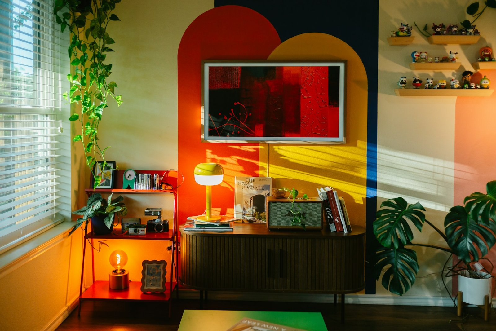
1. Start with one hero pattern
Choose the print you would be most disappointed to lose. That might be a botanical wallpaper, an antique-style rug, a striped sofa or patterned curtains. Treat it as the room’s color map rather than buying several prints independently.
Pull two or three recurring colors from the hero pattern for the rest of the room. A floral with olive, rust and cream, for example, can support an olive stripe, a rust check and plain cream upholstery without looking accidental.
2. Mix pattern scale, not just pattern type
Two busy prints of nearly identical scale can compete even when their colors match. A more reliable combination is one large motif, one medium repeat and one small pattern. Think oversized botanical wallpaper, medium-width stripes and a tiny check.
Changing scale lets each layer perform a different job. From across the room, the large pattern establishes the mood; closer up, smaller prints add detail.
3. Keep a shared color thread
The easiest way to make mixed patterns feel intentional is to repeat at least one color across them. The patterns do not need to match, but they should look as though they belong to the same palette.
For a warm scheme, try chocolate, cream and muted red. For something calmer, use olive, oat and dusty blue. DecorHues’ autumn color palettes are useful starting points for building warmer combinations without defaulting to orange everywhere.
4. Use stripes as the connector
Stripes are unusually good at connecting florals, checks and organic motifs because they are simple and directional. A narrow ticking stripe can sit beside a large floral without adding another complicated image.
Use stripes on a chair, lampshade, curtain edge, throw or small cushion. If the wallpaper is already highly detailed, a two-color stripe often works better than another multicolor print.
5. Let wallpaper set the room’s rhythm
Wallpaper is the most efficient way to establish a repeating pattern over a large surface. Instead of adding many small printed accessories first, start with the walls and decide what level of visual energy the room can still take.
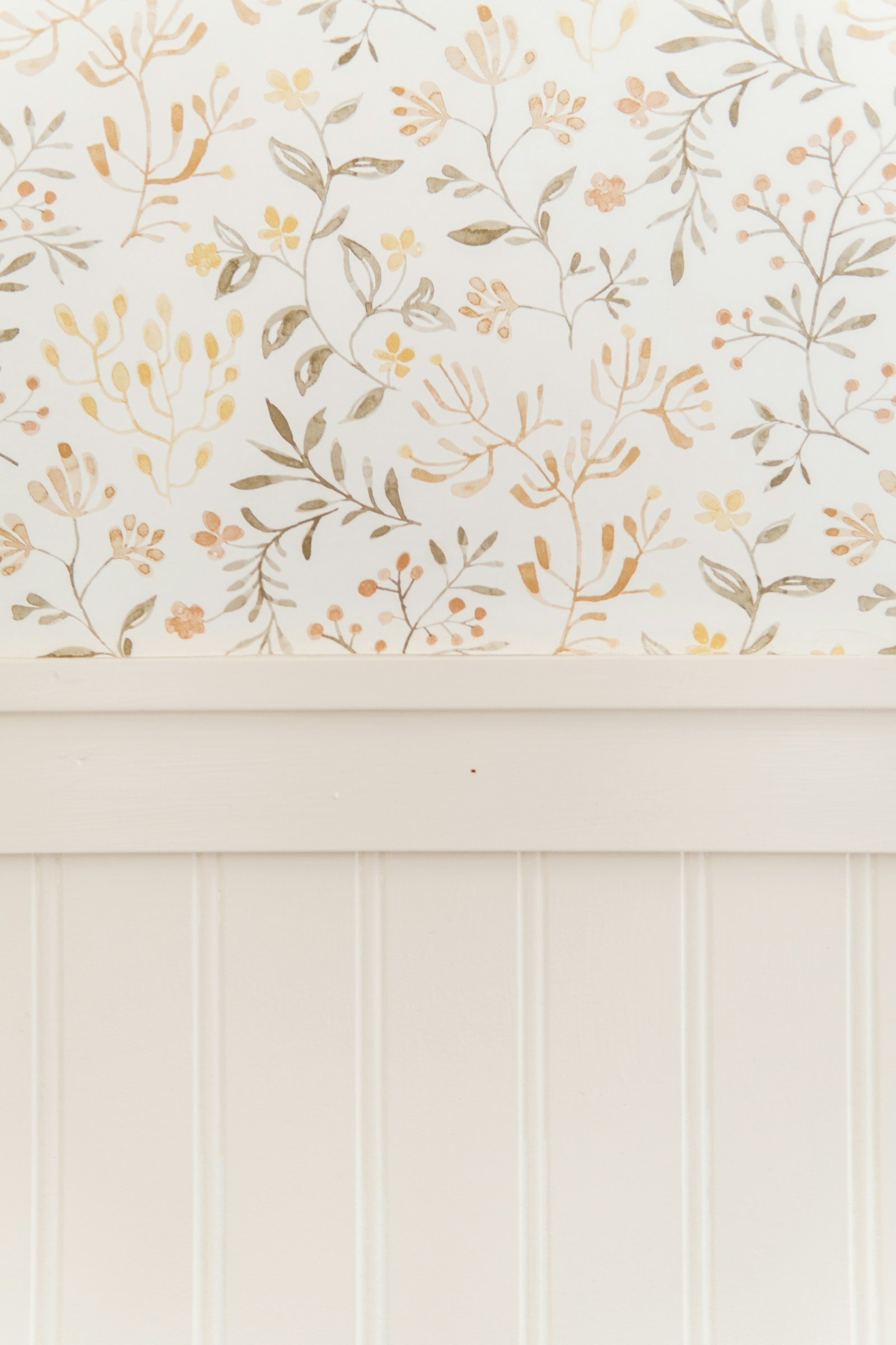
For rooms where full-wall pattern feels too intense, pair wallpaper with wainscoting or panel molding. That gives the print a defined boundary while preserving architectural depth. See our textured wall ideas for ways to combine wallcoverings with paneling, plaster and wood.
6. Pattern-drench a powder room
Small enclosed rooms are ideal places to experiment because they are experienced for short periods and do not need to coordinate visually with a large open plan. A powder room can handle botanical wallpaper, a patterned Roman shade and a decorative floor more easily than a busy family room.
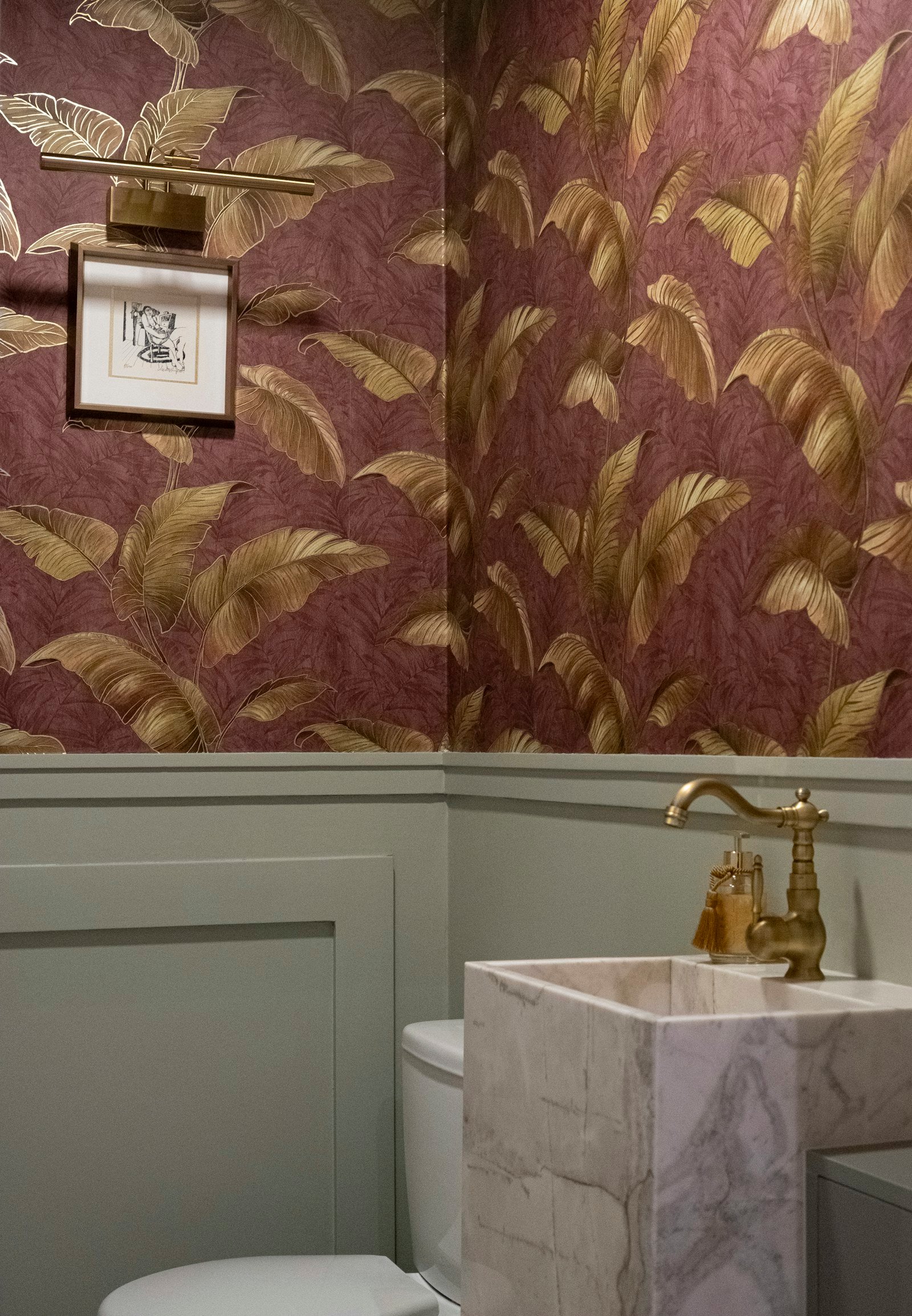
Keep permanent fixtures relatively simple if the walls are expressive. Stone, warm metal and plain-painted trim can ground the pattern. For tighter bathrooms, the same principle works with the layout advice in our small bathroom ideas.
7. Repeat one motif on walls and fabric
Using the same or closely related print on wallpaper and curtains creates a true drenched effect. It can make the boundaries of a room feel softer because the eye reads the surfaces as one continuous envelope.
This works best when the furniture includes quieter shapes and solids. If the walls and drapery share a dense floral, choose a plain bed, sofa or table rather than another highly decorative centerpiece.
8. Pair florals with checks
Florals bring irregular, organic movement; checks bring structure. Together they can feel balanced rather than overly sweet or overly rigid. Use one as the dominant print and the other as support.
A bedroom might combine floral curtains with a small gingham pillow, while a dining room could pair botanical wallpaper with checked seat cushions.
9. Mix an antique-style rug with cleaner prints
A traditional or faded rug already contains several colors and small motifs, so it can act as the bridge between unrelated textiles. Instead of repeating its ornate pattern elsewhere, pair it with simpler stripes, checks or solids.
Placement still matters. Our living room rug guide explains how to size the rug so the pattern anchors the seating group rather than floating in the center.
10. Use pattern on the ceiling selectively
A patterned ceiling can be effective in a powder room, bedroom, dressing area or small dining space. It is most successful when the wall pattern is either related or deliberately quieter.
Before wallpapering a ceiling, check the surface condition and installation requirements. Ceilings expose seams and imperfections differently from walls, and heavier wallcoverings may require professional installation.
11. Keep some large surfaces solid
Pattern drenching does not require eliminating every solid. In fact, a plain sofa, painted trim, wood table or unpatterned floor can make surrounding prints look stronger.
Think of solid areas as punctuation. If every surface carries equal visual information, the room can lose hierarchy. Warm neutrals are especially useful here; see our beige interior ideas for examples of texture and tone that do not rely on print.
12. Use dark pattern without making the room gloomy
Deep green, navy, chocolate and burgundy prints can feel cocooning, especially in rooms used at night. Balance them with warm lamps, lighter upholstery, reflective accents and a few pale surfaces.
Do not rely on one bright ceiling light to rescue a dark patterned room. Layered lighting is more effective because it creates pools of light at different heights. Our living room lighting ideas explain ambient, task and accent layers in more detail.
13. Try pattern drenching in a bedroom
Bedrooms suit pattern because bedding, curtains, rugs and upholstered headboards already provide multiple textile surfaces. Start with one dominant print and repeat its colors rather than its exact motif everywhere.
A floral headboard can work with striped bedding and a small geometric rug when all three share two colors. Keep sheets or the coverlet solid if the room needs a calmer visual center. For a softer overall mood, combine this approach with the layered textiles in our cozy bedroom ideas.
14. Make a dining room feel collected
Dining rooms can carry more pattern than many people expect because much of the furniture is hard-surfaced. Wallpaper, a rug, upholstered chairs and curtains add softness around wood, stone and metal.
If your chairs are patterned, consider a simpler rug. If the rug is ornate, use a smaller print on the seats. The goal is contrast in scale, not identical intensity. Our dining room ideas offer additional guidance on lighting, rugs and furniture mixing.
15. Use cushions as a low-commitment test
Before ordering wallpaper or reupholstering a sofa, test the palette with pillow covers and throws. Combine three patterns in different scales, photograph them together in daylight and lamplight, and remove whichever one consistently feels disconnected.
This is also a renter-friendly way to explore the look. Our apartment decor ideas include other low-commitment ways to change a room without permanent construction.
16. Pattern-drench a reading nook or office corner
A small zone can carry more visual intensity than an entire open-plan room. Wallpaper the back of built-ins, add a patterned chair and repeat one color in a rug or shade.
For a work area, make sure pattern does not interfere with screen visibility or task lighting. Keep the immediate desk surface calmer and use print behind or beside the workstation. See our home office ideas for practical desk and lighting considerations.
17. Combine vintage and new patterns
A collected room often looks more convincing when every textile is not from the same collection. Pair a vintage-style rug or inherited fabric with a newer stripe, block print or botanical wallpaper.
The shared color thread is what makes different eras work together. Avoid trying to match every beige, green or red exactly; slight variation usually looks more natural.
18. Stop before every object becomes patterned
The most common mistake is treating pattern drenching as a quota. Once the walls, rug and upholstery already create a strong composition, plain ceramics, wood, books, metal lighting and solid throws may be exactly what the room needs.
A useful final check is to stand at the doorway and identify the first thing your eye sees. If everything demands attention at once, remove one patterned layer or replace it with a solid in the existing palette.
Pattern drenching: a quick formula
- Choose one hero print and pull two or three colors from it.
- Vary scale: combine large, medium and small repeats.
- Add a connector: stripes or checks are often easiest.
- Keep breathing room: use wood, stone, painted trim or solid upholstery.
- Repeat color, not necessarily pattern.
- Test in the actual light before committing to expensive fabric or wallpaper.
Common pattern-drenching mistakes
- Using several patterns at the same scale.
- Buying prints individually without establishing a palette first.
- Adding too many small patterned accessories after the major surfaces are already busy.
- Ignoring lighting, which can flatten dark patterns at night.
- Matching everything so precisely that the room feels like a showroom set.
- Using trendy prints you do not genuinely like on expensive or difficult-to-replace surfaces.
Frequently asked questions
Is pattern drenching the same as maximalism?
No. Pattern drenching can be maximalist, but it is a technique rather than a complete decorating style. A room can use only two coordinated prints across several surfaces and still feel relatively restrained.
What patterns are easiest to mix?
Stripes pair easily with florals, botanicals, checks and many geometrics. The safest combination uses a shared color and noticeably different pattern scales.
Can pattern drenching work in a small room?
Yes. Powder rooms, small bedrooms, reading nooks and compact offices are good places to use immersive pattern. Keeping the palette controlled and including some solid surfaces prevents the room from feeling visually crowded.
Do all the patterns need to match?
No. They need a relationship, not an exact match. Repeating one or two colors while varying motif and scale usually creates a more collected result than buying every fabric from one coordinated set.
Is pattern drenching just a 2026 trend?
The label is current, but the underlying design practice is not new. Layered wallpaper, upholstery, rugs and textiles have long appeared in traditional, cottage and eclectic interiors. The most durable approach is to choose patterns you genuinely like rather than copying a seasonal combination exactly.
Image credits: Fujiphilm, Taylor Friehl and Caroline Badran via Unsplash, used under the Unsplash License.