18 Textured Wall Ideas That Add Depth Without Clutter
Textured walls are moving beyond the single dramatic accent wall. The strongest rooms use texture to change how light moves across a surface, add warmth without adding more objects, and give simple furniture a more architectural backdrop.
That makes texture especially useful in neutral interiors, where depth has to come from material, shadow and finish rather than strong color contrast. These textured wall ideas range from subtle limewash and grasscloth to stone, brick and dimensional paneling, with practical notes on where each treatment works best.
Quick answer: what are the best textured wall ideas?
For soft texture, start with limewash, Roman-clay-style finishes, linen wallpaper or grasscloth. For stronger architectural depth, use Venetian plaster, wood paneling, brick, stone, fluting or picture-frame molding. Choose the finish by room conditions first: moisture, traffic, cleanability, existing wall condition and whether the installation needs to be renter-friendly.
Why textured walls are especially relevant in 2026
The 2026 U.S. Houzz Emerging Summer Trends Report found strong year-over-year growth in U.S. searches for tactile finishes, including sandstone, linen wallpaper, seagrass wallpaper, Venetian plaster, limewash interior paint and wainscoting. The common thread is not one specific material; it is a move toward walls with visible depth, movement and touchable character.
That direction also fits the warmer colors already appearing across interiors. Texture gives beige, brown, cream, sage and rust more dimension, which is useful if you like the warmth of our beige interior ideas or brown living room ideas but want the walls to feel less flat.
1. Use limewash for soft, cloudy movement
Limewash creates tonal variation instead of a perfectly uniform painted surface. It is a good choice when you want texture to read quietly from across the room and become more visible as daylight moves across the wall.
Warm white, mushroom, clay and muted olive work particularly well because the variation feels intentional rather than patchy. Application and substrate requirements vary by product, so follow the manufacturer’s primer and wall-prep instructions rather than assuming it can go directly over any existing paint.
2. Choose Venetian plaster when you want depth plus sheen
Venetian plaster can range from soft matte movement to a highly burnished, stone-like finish. In a living room or dining room, a pale mineral finish can add depth without competing with art, while a darker polished wall can become the room’s focal point.
Use it where light can graze the surface from a window, sconce or lamp. That side-lighting reveals the hand-applied variation far better than a bright fixture aimed straight at the wall.

3. Try a Roman-clay-style finish for a softer matte look
If polished plaster feels too formal, a matte clay-look finish gives similar tonal movement with less shine. It works well behind a bed, in a home office or across a quiet living-room wall where you want the surface to feel handmade rather than glossy.
Keep the furnishings simple enough that the wall can do some of the visual work. Linen, oak, walnut, wool and ceramic pieces pair naturally with this kind of finish.
4. Add linen wallpaper for tailored texture
Linen-look wallcovering creates a fine woven effect that reads more polished than rough plaster. It is especially useful in bedrooms, dining rooms and home offices because it gives a plain wall depth without introducing a strong pattern.
Use warm neutral tones if you want a calm backdrop, or choose a deep olive, tobacco or navy for a more enveloping effect. In bedrooms, the texture works particularly well with layered bedding like the combinations in our cozy bedroom ideas.
5. Use grasscloth for organic variation
Grasscloth brings visible fibers, seams and natural color variation, which is part of its appeal. It can make a dining room, office or powder room feel more collected than a perfectly printed wallpaper.
Because natural fibers can be more sensitive to moisture, stains and abrasion than washable vinyl wallcoverings, choose placement carefully and check the manufacturer’s cleaning guidance before using it in high-traffic or damp areas.
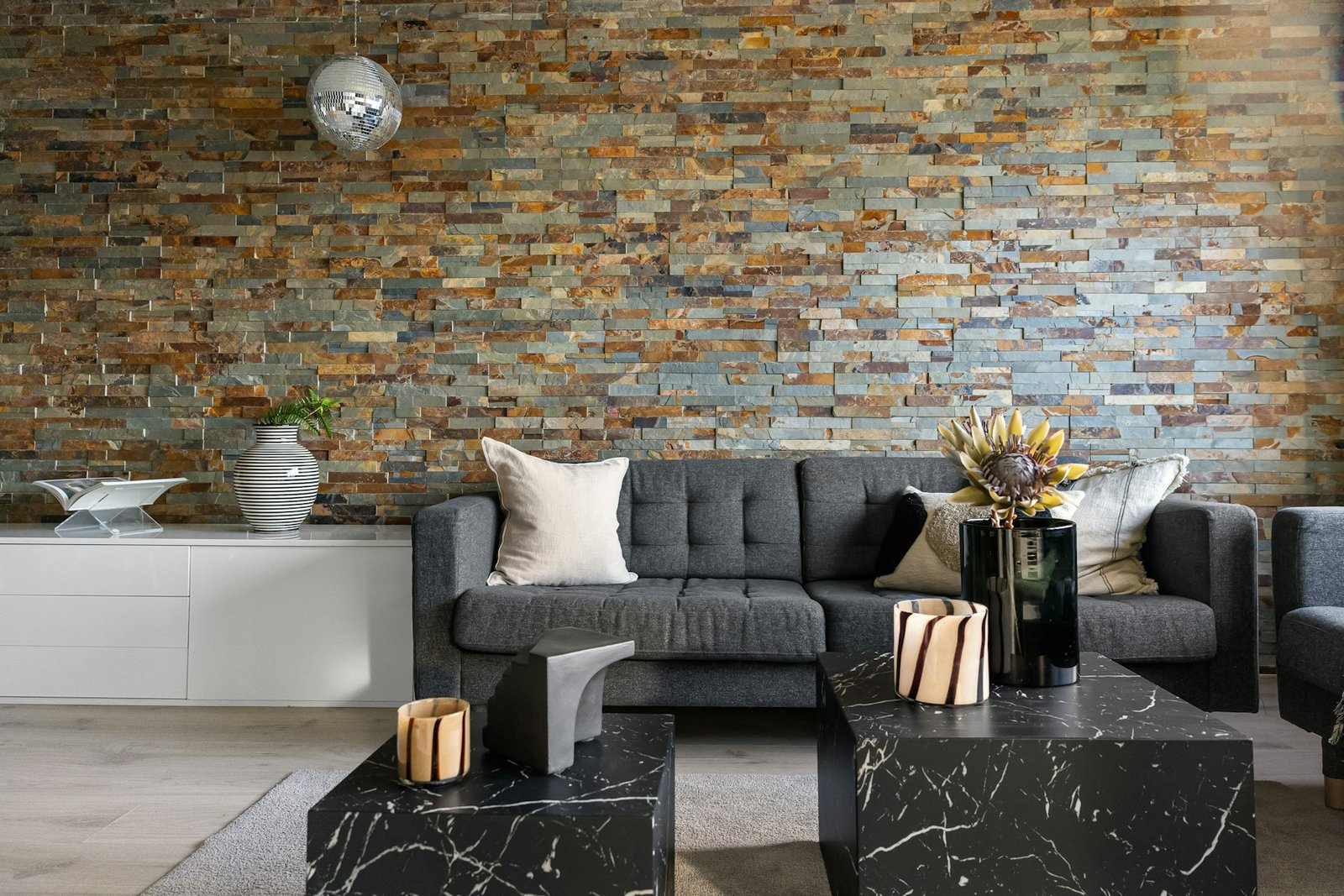
6. Bring in real or veneer stone for weight and permanence
Stone creates the strongest sense of material depth on this list. It works best when tied to architecture: a fireplace wall, a structural-looking feature, an entry transition or a wall that connects visually to exterior masonry.
For modern rooms, keep the joints and surrounding decor restrained. Cream upholstery, warm wood and simple lighting stop stone from turning the room into a theme.
7. Keep exposed brick where it adds real architectural character
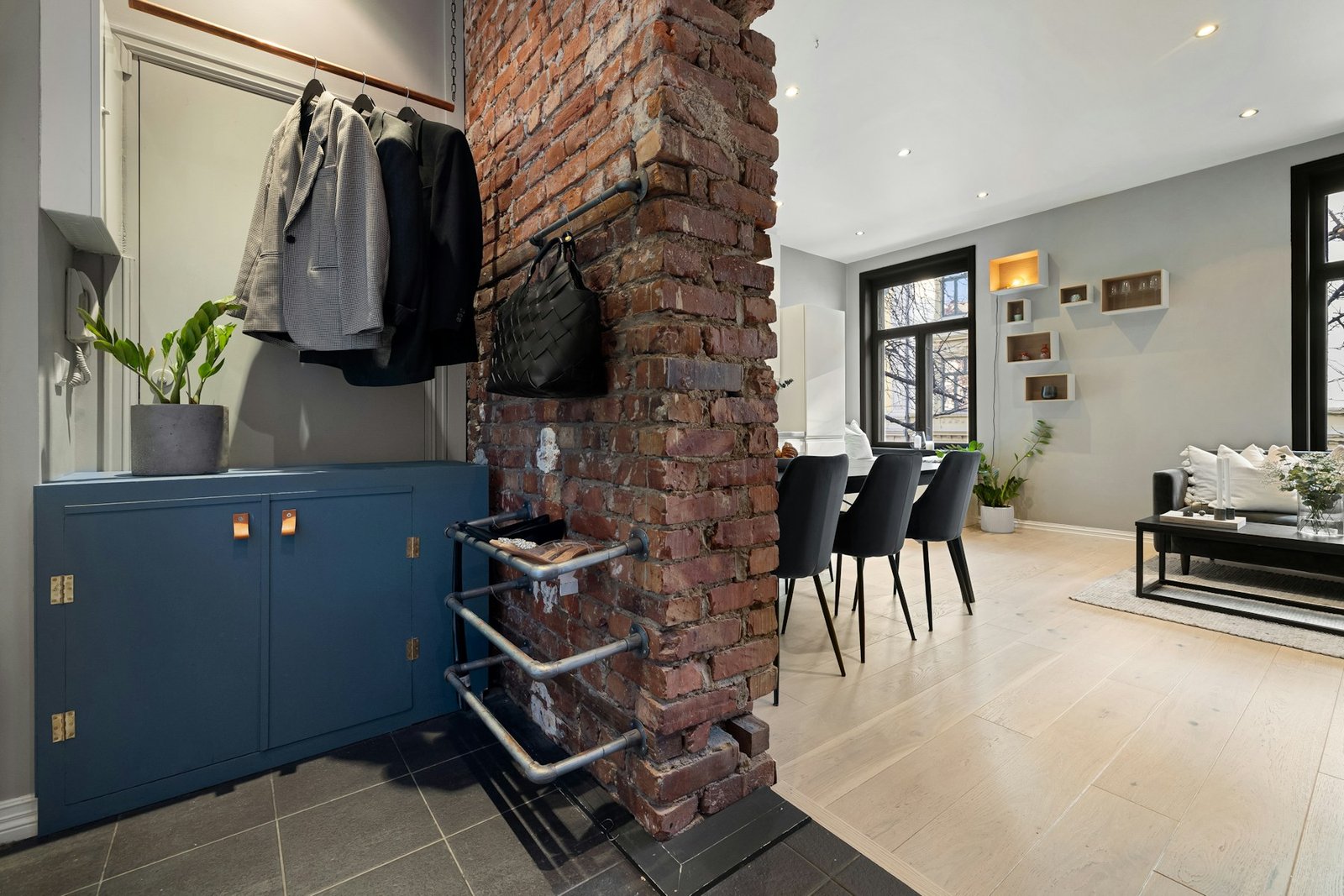
Exposed brick works best when it feels connected to the building rather than added as a decorative costume. In lofts, older homes and conversions, leaving one original brick wall visible can provide enough texture for the whole room.
Balance red or brown brick with quieter surfaces nearby. Warm white walls, simple oak, black metal and restrained textiles let the irregular masonry stand out without making the room visually busy.
8. Use vertical wood slats for rhythm and warmth
Wood slats add repeated vertical lines that can make a low room feel taller and a media wall feel more finished. Oak and walnut are easy choices for warm modern interiors, but the most important decision is how much of the wall to cover.
A narrow section behind a console or TV often gives enough rhythm. Covering every wall in slats can make a compact room feel visually dense, especially when the wood tone is dark.
9. Try classic panel molding for subtle architectural relief
Picture-frame molding and applied trim create texture through shadow instead of a rough surface. Painted the same color as the wall, the effect is quiet and works in traditional, transitional and modern rooms.
This is also one of the easiest treatments to combine with color drenching: painting the wall, molding and trim in one hue makes the relief more noticeable without breaking the room into contrasting bands.
10. Use wainscoting where walls need practical protection
Wainscoting is useful in dining rooms, hallways and entry areas because it adds architectural depth at the same height where walls often get bumped or marked. Pair it with paint or wallpaper above rather than forcing the lower and upper wall to compete.
In a dining room, a darker lower section with a warmer neutral above can create a grounded effect without making the entire room dark. See our dining room ideas for more ways to balance wall detail with furniture and lighting.
11. Add fluted or ribbed panels behind one focal area
Fluted panels create stronger light-and-shadow contrast than flat wood slats. They work well behind a console, headboard, bar cabinet or built-in bench, especially when the rest of the room is simple.
Use a low-relief profile in small spaces. Deep grooves collect more visual shadow and can feel heavy if they cover too large an area.
12. Use microcement for a seamless modern surface
Microcement creates a continuous, mineral-looking wall with subtle tonal variation and few visual interruptions. It suits modern kitchens, fireplace surrounds and minimalist living areas where grout lines or busy pattern would feel distracting.
Because systems vary in waterproofing, sealing and approved substrates, treat bathrooms and wet zones as technical installations rather than decorative DIY projects. Use a product and installer appropriate for the specific location.
13. Let tile become wall texture outside the shower
Tile does not have to stop at a backsplash or shower. Handmade-look zellige, ribbed ceramic and lightly irregular stone tile can create a textured wall in powder rooms, kitchens and fireplace areas.
If the surface already has visible variation, keep grout close to the tile color for a calmer look. Strong grout contrast adds another pattern layer and can make a small wall feel busier.
14. Use textured wallpaper when you need a lower-commitment option
Embossed and textured wallpapers can imitate linen, plaster, grasscloth or small-scale relief without rebuilding the wall. They are useful when you want a more predictable finish than hand-applied plaster.
Renters can look for removable versions, but test adhesion and removal in an inconspicuous area first. Our apartment decor ideas include more low-commitment ways to personalize rental walls.
15. Use a textured wall as a video-call backdrop
A home office wall does not need shelves full of objects to look intentional on camera. A quiet plaster finish, fine grasscloth or restrained molding can create depth without visual clutter behind your desk.
Keep contrast moderate so cameras expose your face correctly. If you are planning the whole workspace, our home office ideas cover desk placement, lighting and compact work zones.
16. Add texture around a fireplace instead of across the whole room
A fireplace already acts as a natural focal point, so it is an efficient place to concentrate material. Plaster, stone, tile or vertical paneling can frame the firebox while the remaining walls stay simple.
Check heat-clearance and material requirements for the specific fireplace system before installing decorative finishes near the opening or venting components.
17. Let one dark textured wall create contrast
Charcoal, espresso, forest green and deep navy become richer when the surface is not perfectly flat. A textured dark wall can work behind a cream sofa, pale bed or warm wood console without requiring many additional decorative objects.
Use side lighting so the relief remains visible after sunset. The same principle appears in our living room lighting ideas: light from several directions gives materials more dimension than one bright overhead source.
18. Mix texture with restraint
The easiest way to make textured walls feel expensive is to let one or two materials lead. If you already have rough stone, you may not also need fluted paneling, heavy grasscloth and a highly patterned rug in the same sightline.
Repeat quieter materials instead: wood from the wall can reappear in a side table, or the wall’s warm mineral color can show up in pillows and ceramics. The room feels connected without looking matched.
Textured wall finishes compared
| Finish | Visual effect | Good locations | Main consideration |
|---|---|---|---|
| Limewash | Soft, cloudy movement | Living rooms, bedrooms, halls | Correct substrate and prep |
| Venetian plaster | Mineral depth, optional sheen | Living, dining, feature walls | Skilled application |
| Grasscloth | Natural woven fibers | Bedrooms, offices, dining rooms | Moisture and stain sensitivity |
| Wood slats | Warm linear rhythm | Media walls, entries, offices | Can feel heavy when overused |
| Stone or brick | Strong architectural texture | Fireplaces, structural focal walls | Weight, installation and permanence |
Common textured wall mistakes
Using texture everywhere. Too many competing surfaces can make a room feel smaller and busier.
Choosing by appearance alone. Moisture, cleaning, heat, traffic and wall condition should narrow the material choices first.
Ignoring lighting. Texture needs light from an angle to show its relief; flat frontal light can erase the effect.
Skipping samples. Hand-applied and natural materials change with light and installation. Test a meaningful sample in the actual room.
Forgetting transitions. Plan how the finish ends at corners, baseboards, outlets, doors and adjacent materials before installation starts.
Frequently asked questions about textured walls
Do textured walls make a room look smaller?
Not automatically. Fine texture such as limewash or linen wallcovering can add depth without visually shrinking a room. Deep relief, dark stone or heavy paneling has more visual weight, so use it selectively in compact spaces.
What is the easiest textured wall look to live with?
For many homes, subtle limewash-look paint, fine textured wallpaper or painted panel molding is easier to integrate than very rough stone or deep 3D panels.
Can textured walls work in a small room?
Yes. Keep the relief shallow and the color relationship simple. A small bedroom can handle a softly mottled wall behind the bed, while a narrow office can use fine grasscloth or painted molding.
What colors work best with textured walls?
Warm white, mushroom, beige, taupe, clay, olive, brown and muted blue all show texture well. Dark colors emphasize shadow; pale colors emphasize subtle surface movement.
Are textured walls hard to clean?
It depends on the material. Smooth sealed finishes are easier to wipe than porous grasscloth, rough brick or heavily textured plaster. Check the specific product’s cleaning and maintenance instructions before choosing it for a high-traffic area.
Where to start
Choose the wall that already matters architecturally: behind the bed, around the fireplace, behind the sofa, at the dining area or behind a desk. Then decide whether the room needs soft surface movement or strong relief. That one decision usually narrows the list quickly.
For related inspiration, explore our Paint Color Ideas, Lighting Ideas and warm neutral home decor ideas to coordinate wall finish, color and light.